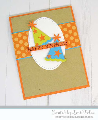
Hi, everyone, it's time for a new challenge! Barbara here with your colors for this week. Remember, we're using generic colors, so as long as you use the color values shown: orange, turquoise, green, and Kraft you'll be good...the color police won't come after you--this is all about having fun! And, feel free to incorporate any other neutrals you need in your design, as well.
If you upload to a public gallery, please use the key words CTD682, and please use #ctd682 and #colorthrowdown on social media sites. Also, when linking up your card using the linky tool at the bottom of the post, please link to your specific post, not a generic link to your blog--all of the "rules" are in the right sidebar, so check 'em out to be sure. Importantly, though, no digital designs, only digital images that are printed off and colored will be allowed. Totally digital designs will be removed from the link up.
For more inspiration, check out the design team members' creations below, and get inky! We can't wait to see what you come up with this week.
Barbara Anders - Paper Pursuits
Susie Moore - Created 4 Creativity
Toni Maddox, Guest Star Stamper - Frankie Helps Craft
Amy Rohl - Ink About Me
Wanda Cullen - Cullen-ary Creations
Broni Holcombe - Splashes of Watercolor
Lynn Put - The Queen’s Scene
Vickie Zimmer- Smitten


2 comments:
Love it. But it's more Orange,real/turquoise, green & Kraft... Or am i nuts... got a cut Idea in my head already.
No, you're not nuts, LOL! Thanks for the heads up--it's fixed!
Post a Comment